Suzanne Collins' Site

2024

Why does a world renowned author have a site that looks like a blog from 2005? How can it be more representative of her and her work?

CLIENT

Suzanne Collins

role

Part of UX Research team, sole Designer

Timeline

7 months

Quick look

A multi-method usability evaluation of Suzanne Collins’s official website revealed major issues in navigation, structure, and engagement. Using surveys (n=20), pre/post-test questionnaires (n=10), and task-based usability testing, we identified consistent pain points and created design recommendations.

  • Key Issues: confusing navigation, broken or ineffective links, word-heavy pages, no purchase pathways
  • Methods: online surveys, heuristic evaluation, pre/post usability questionnaires, in-person task testing (10 participants)
  • Outcome: a user-centered redesign framework with modern layout, clear book discovery paths, and engagement opportunities
No items found.

The Challenge

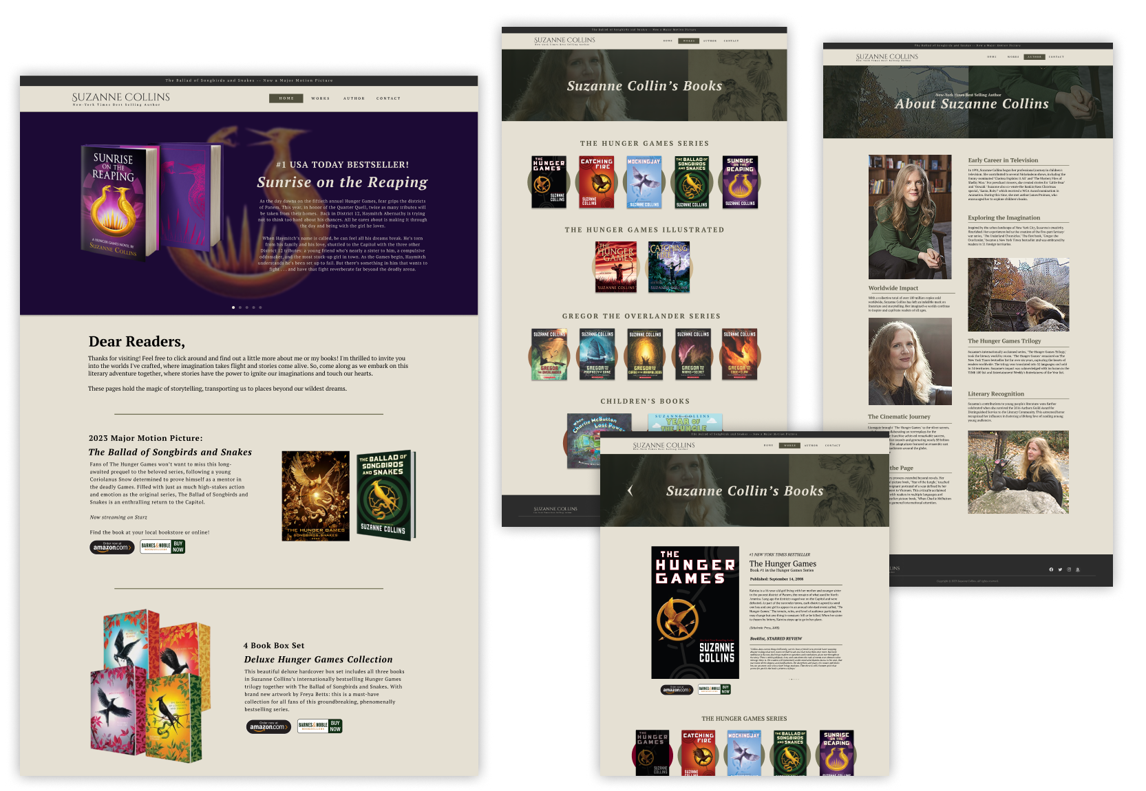
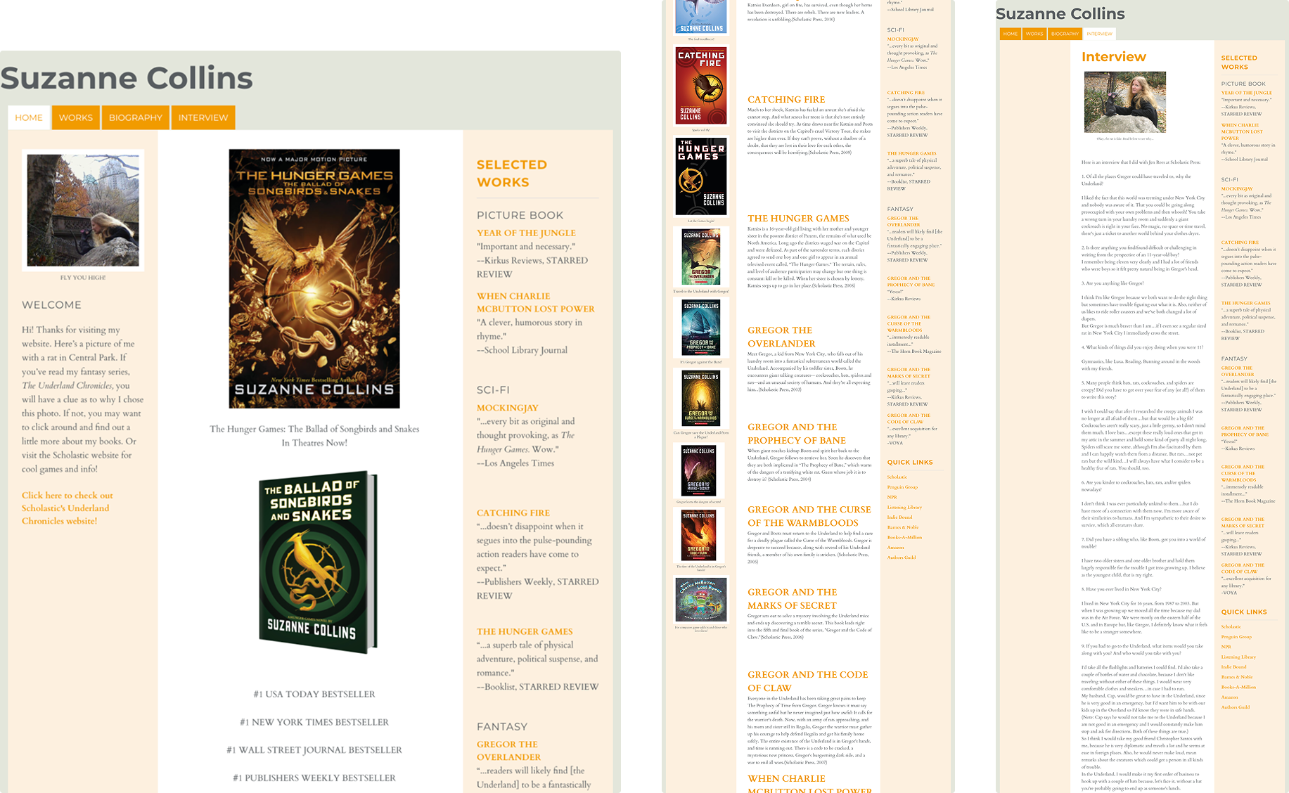
Despite Suzanne Collins’s success as the author of The Hunger Games and other works, her official website does not meet user expectations (see below).

  • What users expect:
    • Easy access to book listings in order
    • Direct purchase options
    • Upcoming release announcements
    • A welcoming, professional brand presence
  • What the site provides:
    • Cluttered, outdated layout
    • Confusing or redundant links
    • Minimal engagement beyond static text

Project Goal: Modernize the site so it reflects Collins’s success, improves usability, and supports both casual fans and serious readers.

No items found.

User Insights

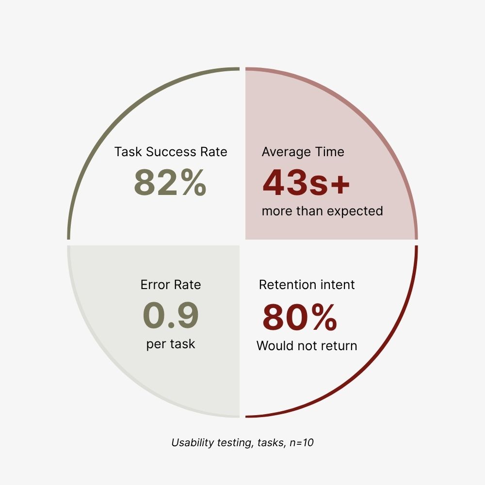
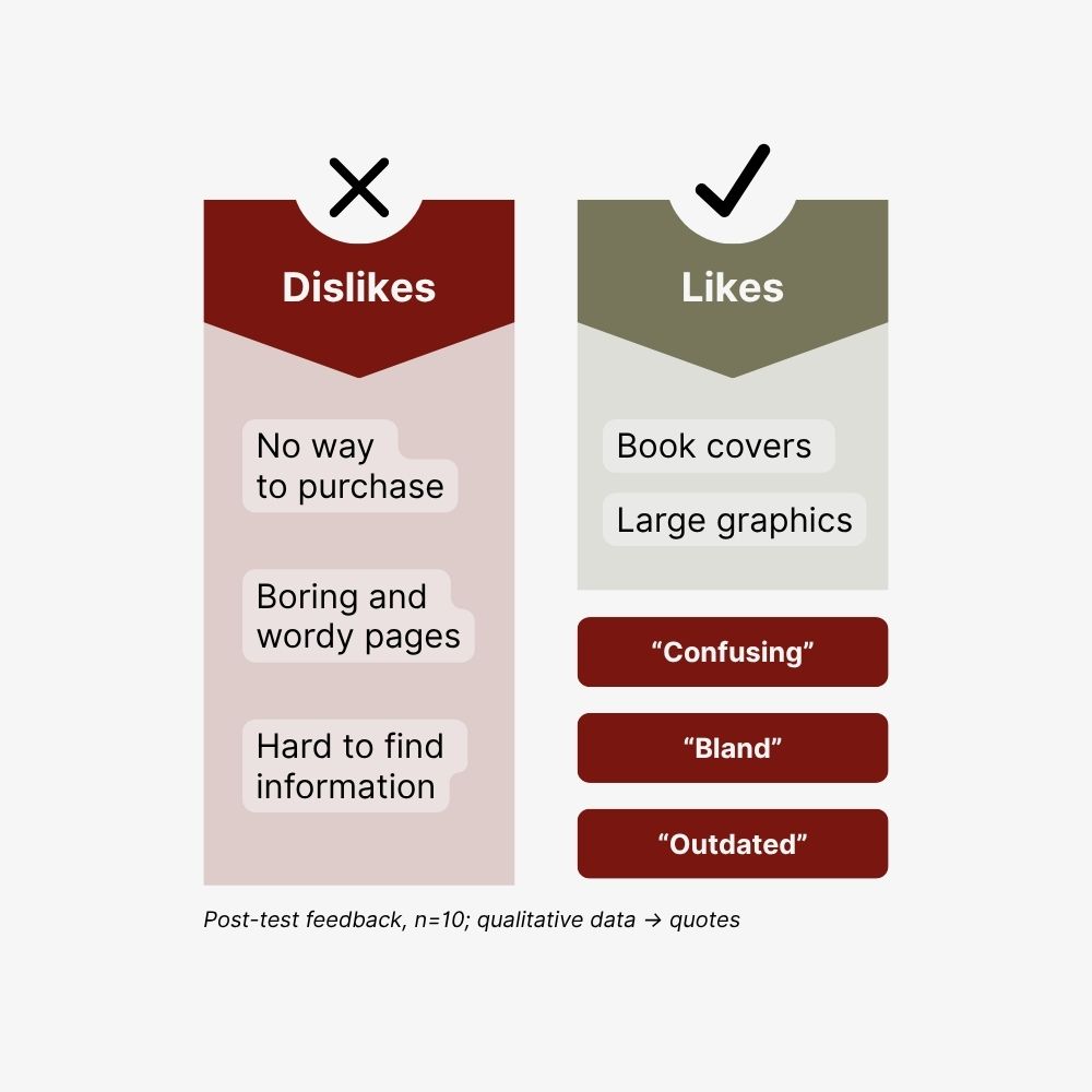
Pre-test users felt comfortable navigating websites(n=10, average 7.6/10) and noted that some of the most frustrating by cluttered layouts. Qualitative findings reinforced these issues were found in Suzanne Collins' site—users often got lost, disliked wordy pages, struggled to distinguish clickable vs non-clickable elements, and voiced complaint at a lack of purchasing options.

No items found.

The Fix

With clear usability issues identified, I began experimenting with possible design directions.

  • Wireframes: simplified navigation and structured content around books, purchasing, and author info
  • First Aesthetic Attempt: tested a burgundy and gold palette — visually strong, but too heavy and off-brand
  • Insight: the site needed a design that felt professional, approachable, and imaginative, not overly formal

Shaping the Look

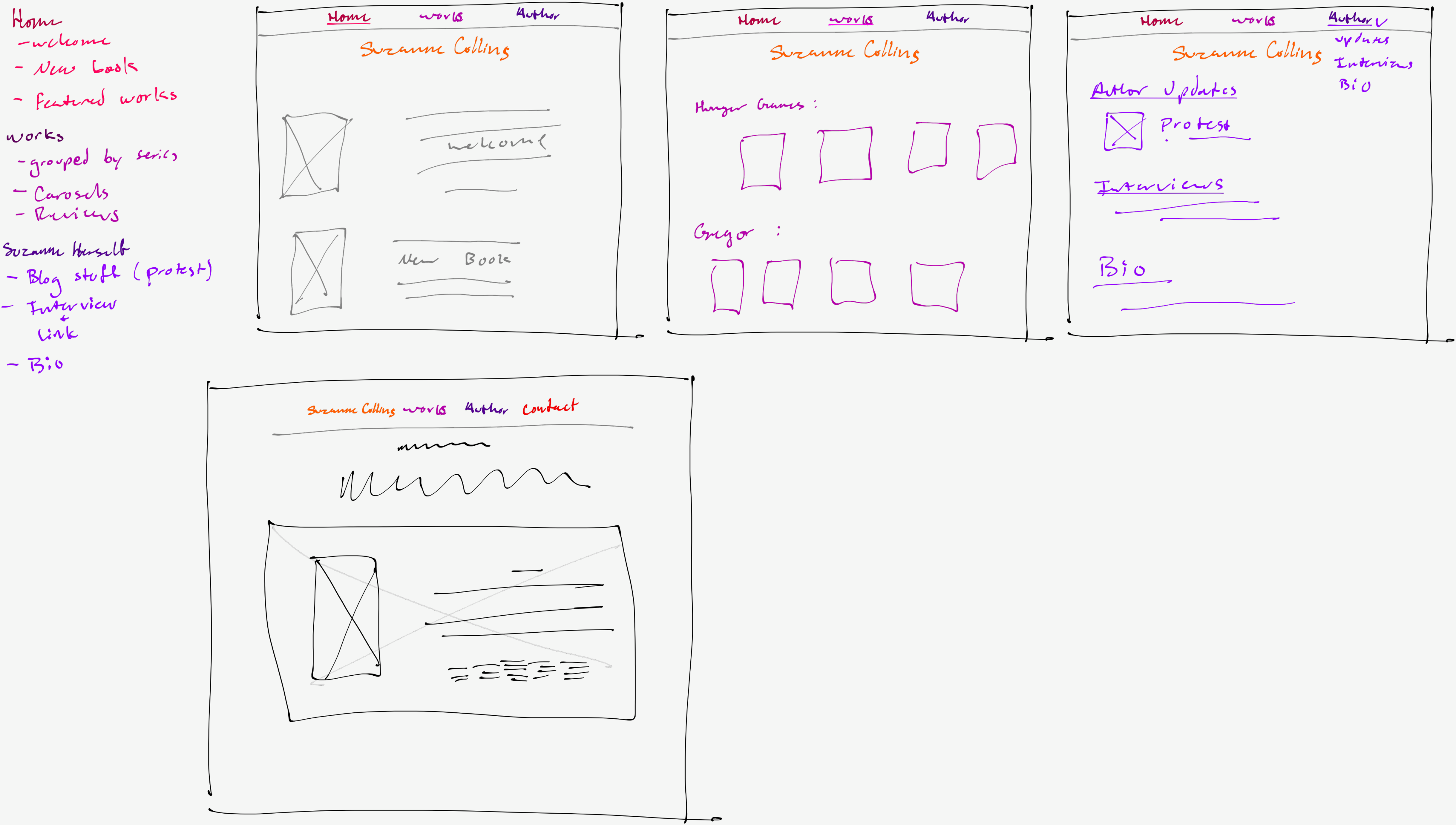
To refine the design direction, I focused on visual style and branding.

  • Mood Board: collected colors, typography, and imagery to define a tone that balanced professionalism with warmth
  • Modern Homepage Design: applied these insights to create a cleaner layout, clear hierarchy, and engaging welcome page
  • Result: a design approach that turned usability findings into a tangible, user-centered visual direction

The Fix

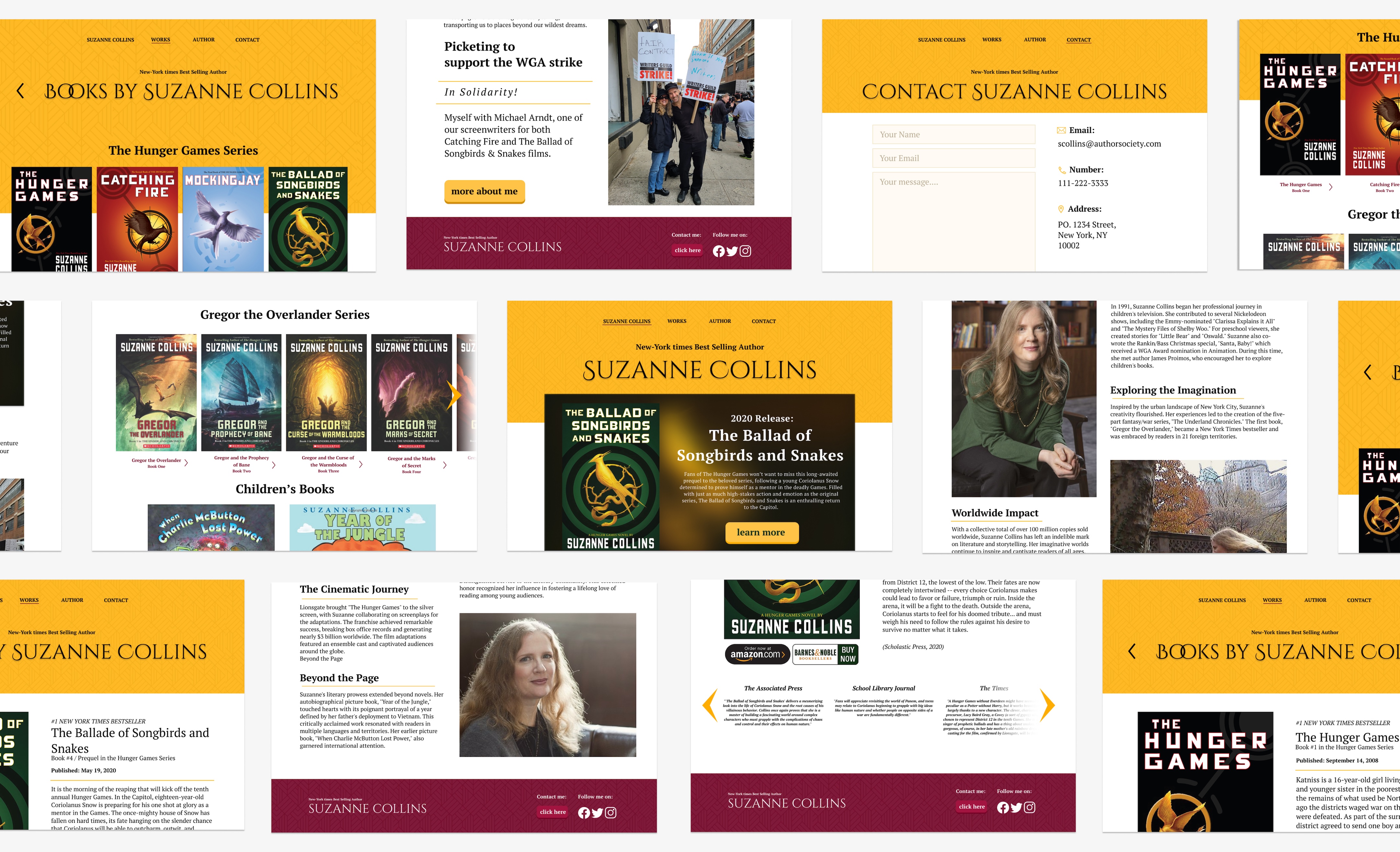
From research and design iterations, we developed clear recommendations to improve the site.

  • Redesign structure & layout: streamline navigation, modernize visual design, and align with brand identity
  • Books: chronological listing, reviews at the bottom of each book page, direct purchase links
  • Author Engagement: concise bio, linked video interviews, contact page, socials linked
  • Welcome Page: highlight new releases and provide updated, engaging entry point

No items found.

Final Takeaways

The existing site fails to meet user needs or reflect Collins’s brand. By addressing structure, design, and engagement, the redesign:

  • Delivers a clear, intuitive browsing experience
  • Supports reader engagement and loyalty
  • Better reflects Collins’s success and professionalism
  • Enables easy book discovery and purchasing, even without buying function on the site itself